OnePlus 5T Star Wars Limited Edition hands-on review

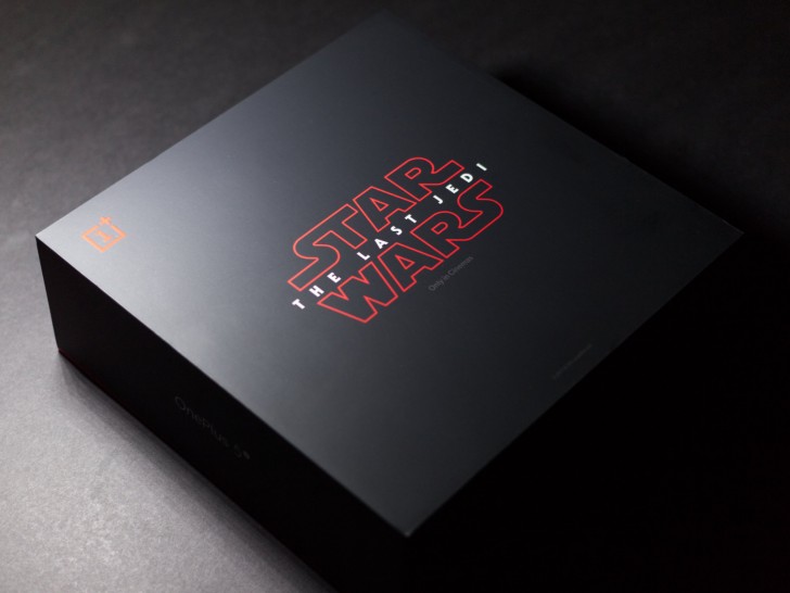
The OnePlus 5T Star Wars Limited Edition is finally here and we have had one in-house to play with for a few days. Normally, we would do a full review but since, outside of a few aesthetic differences, this is still the that released last month, this feature will pretty much just focus on those changes and we would direct you to of the OnePlus 5T for further reading. With that said, let's get on with this. The very first thing you will notice when you get this phone in your hands is the packaging. OnePlus phones have had a fairly basic white and red packaging for a couple of years now but this edition comes in rather large black box that is nearly twice the size of the normal one. The black top of the box proudly features the Star Wars: The Last Jedi logo. In fact, if you don't look closely, you might miss the small OnePlus logo at the top left and have no idea what's inside this box. Lifting the lid reveals the phone placed front and center with its back facing upwards. What you don't see in the picture below is the unsightly IMEI label that we removed so the phone looks presentable. We wish OnePlus had found a better place to put it but at least it's removable. Before we get to the phone, let's take a look at the other contents below. The most striking thing here is the custom designed case, which we will talk about later. Underneath the case is a box containing the SIM removal tool, some paperwork and a set of stickers with OnePlus and Star Wars logos. Below that is a card with the Star Wars logo and a message from OnePlus on the back. You also get the standard Dash charger and cable in the box, which are identical to the ones you get with the standard 5T. Still, because they were already white and red, they work surprisingly well with the new design and don't look out of place at all. Circling back to the phone, the biggest change on this edition is clearly at the back. The metal has been painted in matte white, which has a smooth, ceramic-like finish. This is a decidedly gripper texture than the one on the standard 5T and if you thought that was slippery than this should definitely feel more secure. Yet, as unique as this texture feels, it doesnt actually feel like metal anymore, which some might not like. Also, its likely this material wont age well and the combination of white and matte finish will soon will show signs of wear and tear easily, so its not a surprise the phone comes with its own case. Since the paint covers the entire metal surface, there are no visible antenna lines on this phone. Near the bottom of the back is the Star Wars logo finished in red. The logo just says 'Star Wars' instead of 'Star Wars: The Last Jedi' as seen everywhere else, from the packaging to the case. The only other bit of red on the entire phone is the slider on the side, which looks quite striking. The rest of the accents on the phone are done in black to go with the light and dark theme. This includes all the buttons, the SIM tray, the logo, and the ring around the camera. Technically, these parts aren't new and are the same as those used on the standard 5T. What changed are the bezels on the ports at the bottom, the grille, the screw slots, the flash ring and the fingerprint sensor ring, which are now polished steel instead of being painted black. From the front, the Limited Edition looks nearly identical to the standard 5T. You only see a hint of that white back around the edges of the phone along with a little glimpse of that red slider every now and then. This keeps the front entirely black and distraction-free. Moving to the case, the phone comes with a rather burly rubber case. It has a protruding back with a peculiar pattern on it. The sides protrude towards the corners and flatten towards the center. The case has cutouts for all the ports, the fingerprint sensor, the camera, and the slider. It has its own buttons that are clicky and work well. The case is rather nice but sadly not completely without flaws. First of all, we can't say we love the pattern on the back. Regardless of whether it is actually part of the Star Wars universe in some way, it isn't particularly attractive and looks a bit over the top. The center portion of the back juts out so much the phone practically turns into a top when placed on its back, and has to be kept face down. The sides are also so wide that they make using the phone one-handed difficult. Lastly, the slider is quite difficult to use within its sunken cutout. The last piece of novelty with this edition is in the software. The Limited Edition comes with a special Star Wars theme as well as a handful of Star Wars wallpapers. The theme is basically the dark theme with red accents and works quite well. As for the wallpapers, there are quite a lot of them and they are all tastefully designed. There aren't any of OnePlus' other wallpapers here though so if you don't want any Star Wars wallpapers you will have to get your own. There is also one final bit of change and that is the clock widget, which has been slightly redesigned with a new font. The OS build numbers on our Star Wars Limited Edition and standard 5T were identical, so they should ideally get updates at the same time. However, we are not sure what would happen if you flashed a standard ROM on this phone. As of now, there is only one ROM available on OnePlus website and I'm not sure if they will release a separate ROM for the Limited Edition. Overall, we think the Star Wars Limited Edition has some good things going for it, like the special packaging with a case and some custom wallpapers and theme. However, while some may prefer the subtle redesign and lack of in-your-face branding, we do think it is a bit underwhelming and the actual phone could have been more Star Warsy. Second, while the presence of a case is nice, the design might not be to everyone's tastes and it does have some usability issues. For Star Wars fans who were also looking to buy a OnePlus 5T, this might be a no-brainer. Everyone else should just go with the standard model and wait for the wallpapers to show up on the web.
